Redesign interface for an O2O marketing solution application
Recreated the mobile app experience and UI system for iShapon
While the iShapon team was improving their IoT device, I redesigned their app experience and created a new UI system.
Linctronix is an Internet of Things (IoT) software solution provider, and iShapon is their mobile app product that provides an O2O marketing solution by connecting the app to their Bluetooth code reader. By placing mobile phones near the reader, users are able to earn and redeem reward points or coupons in-store. In 2017, while the iShapon team was improving the device itself, they reached out to us and hope to enhance their app experience and create a UI system.
My Role
As the UX/UI designer in this project,
I worked closely with the product manager and the iShapon’s engineer team to define and solve the current issues in terms of iShapon’s app experience.
- I also led the design team to create app pages and define the app design system.
TEAMS
Product Manager, Designers, Developers & Engineers
CLIENT
Linctronix Ltd.
Pre-creation
Looked into problems of the existing app
Since the iShapon team wanted to add features, I also looked into the existing app experience. We eventually found some significant issues in the information architecture.
Key Improvements 01
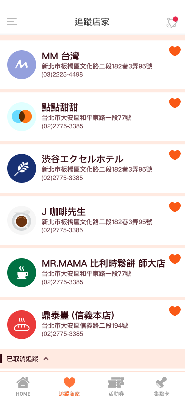
Reorganized information under the hot event page
There were many features under the hot event that users do not expect to be there. To be specific, it doesn’t make sense that stores and setting pages can only be found under the hot event page. Thus, I proposed that store and profile setting to be individual doorways.
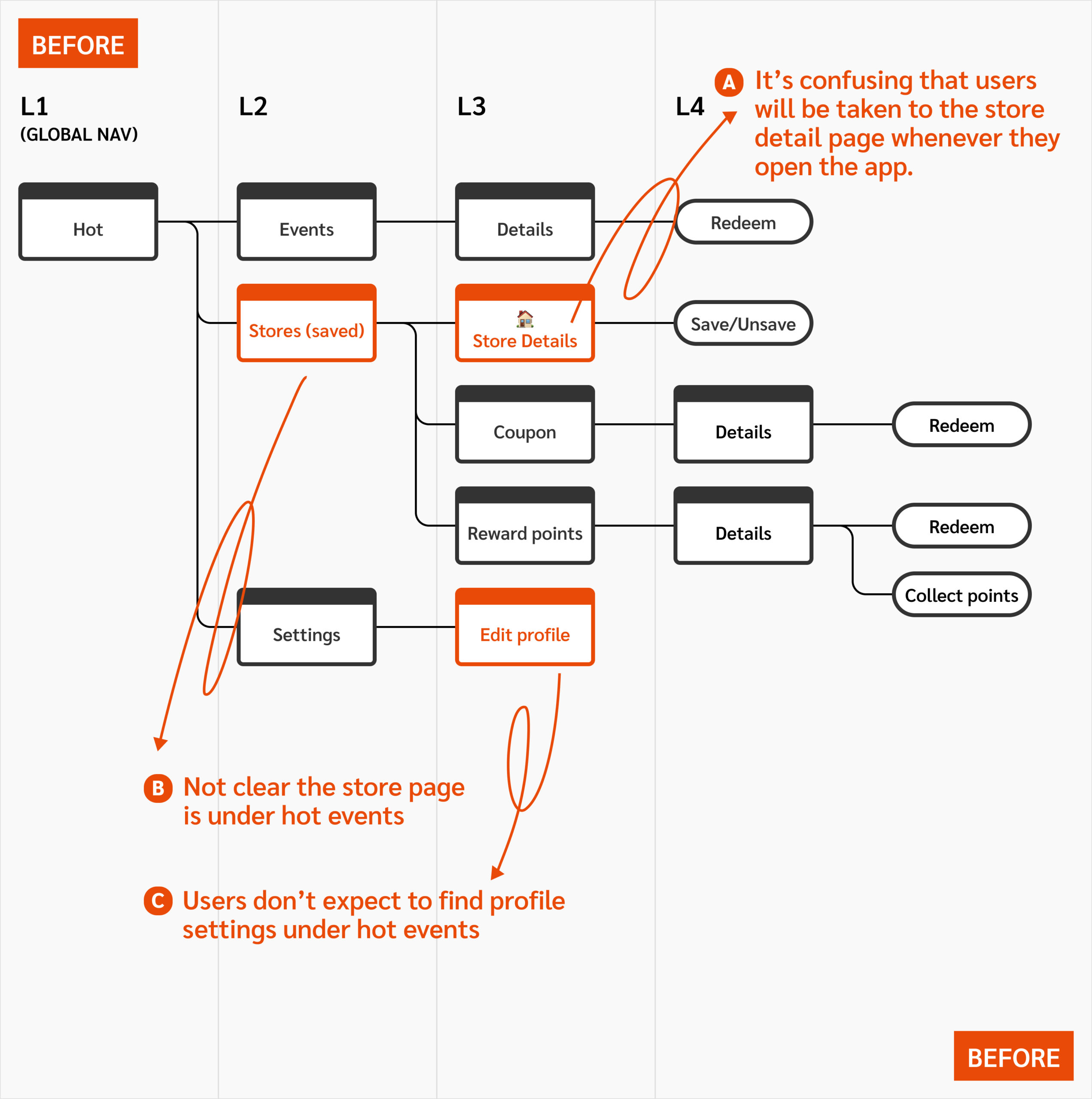
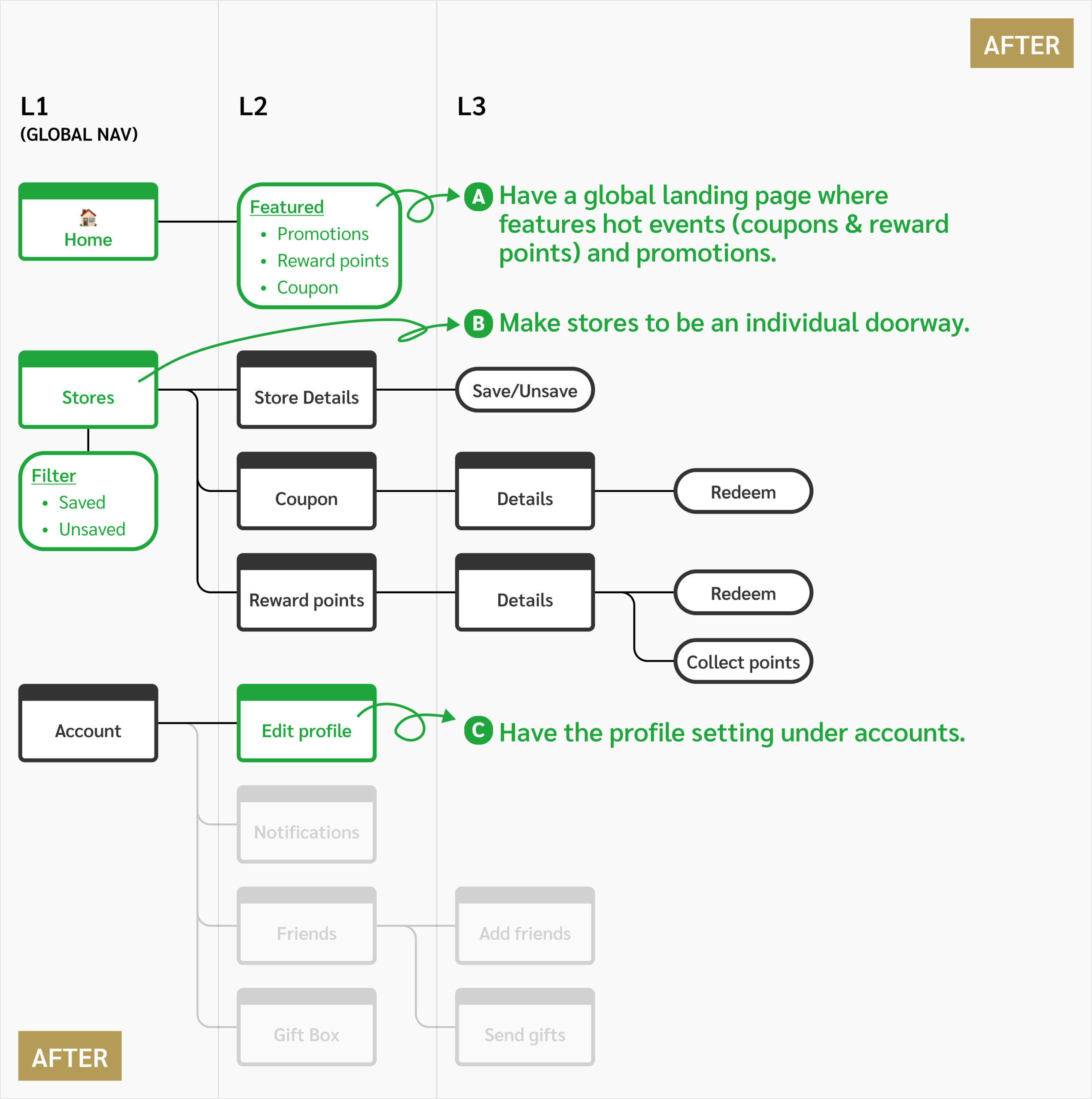
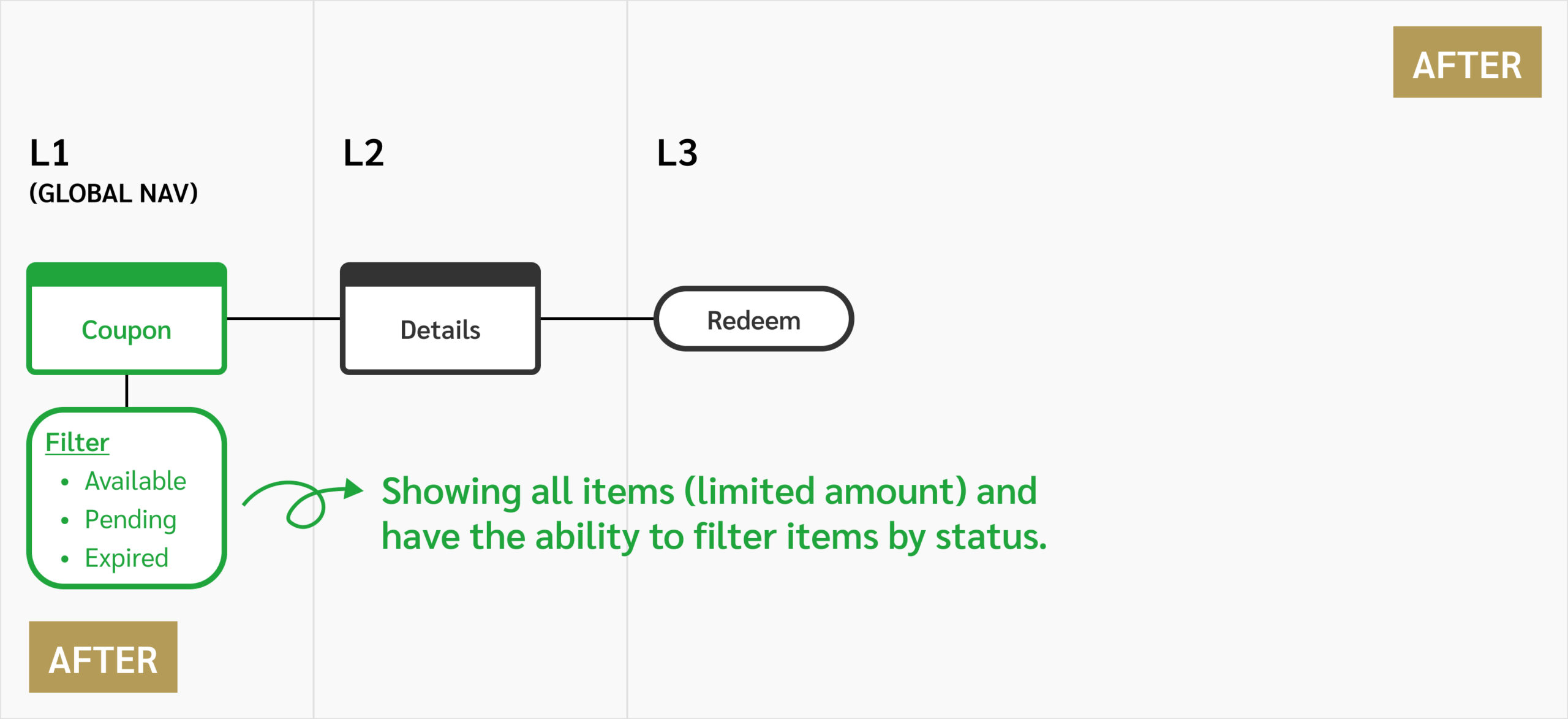
Key Improvements 02
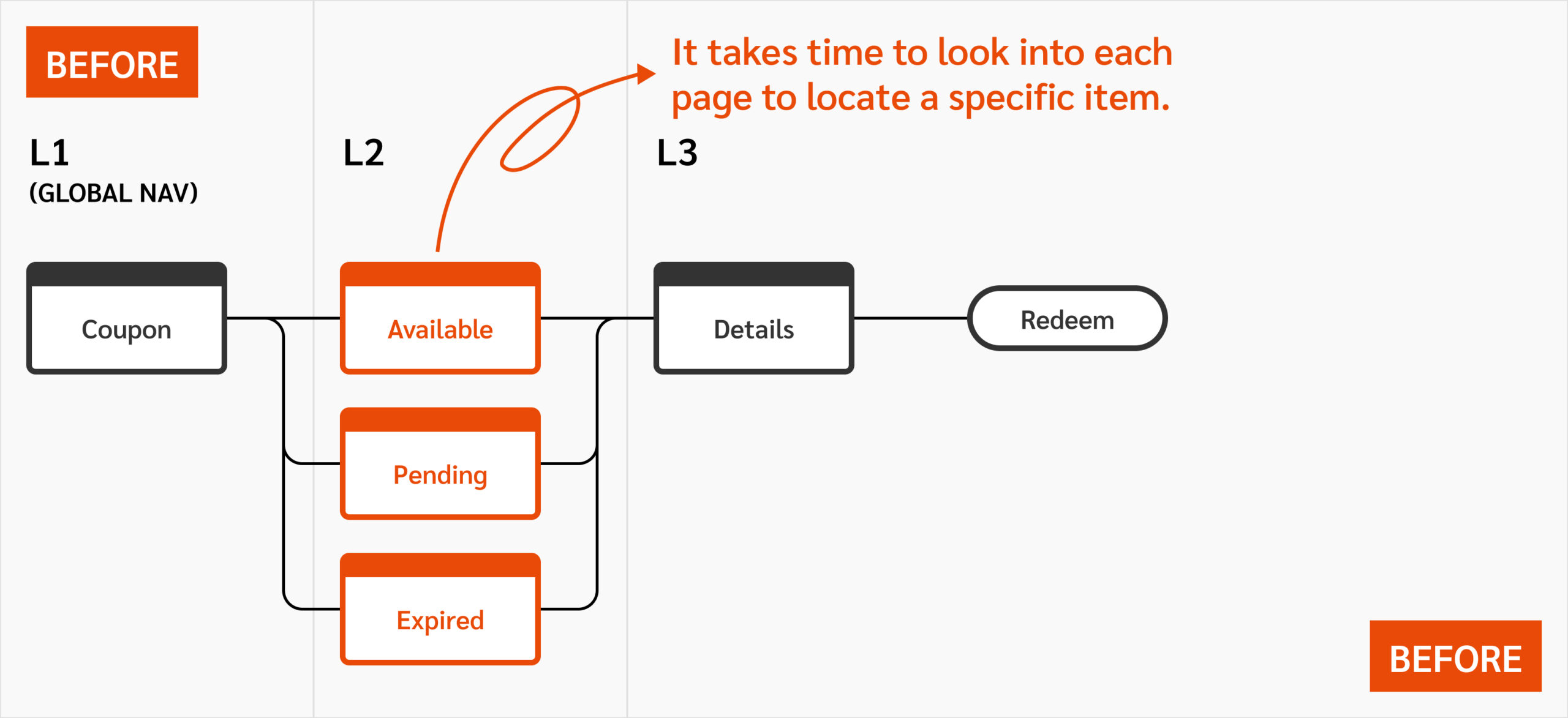
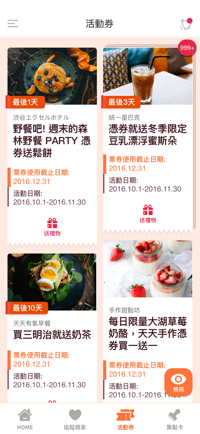
Added filters instead of putting items into different pages
People usually don’t remember the status of all events. So that means users won’t expect to find an item on the expired page while they have no context of an exact expired date.
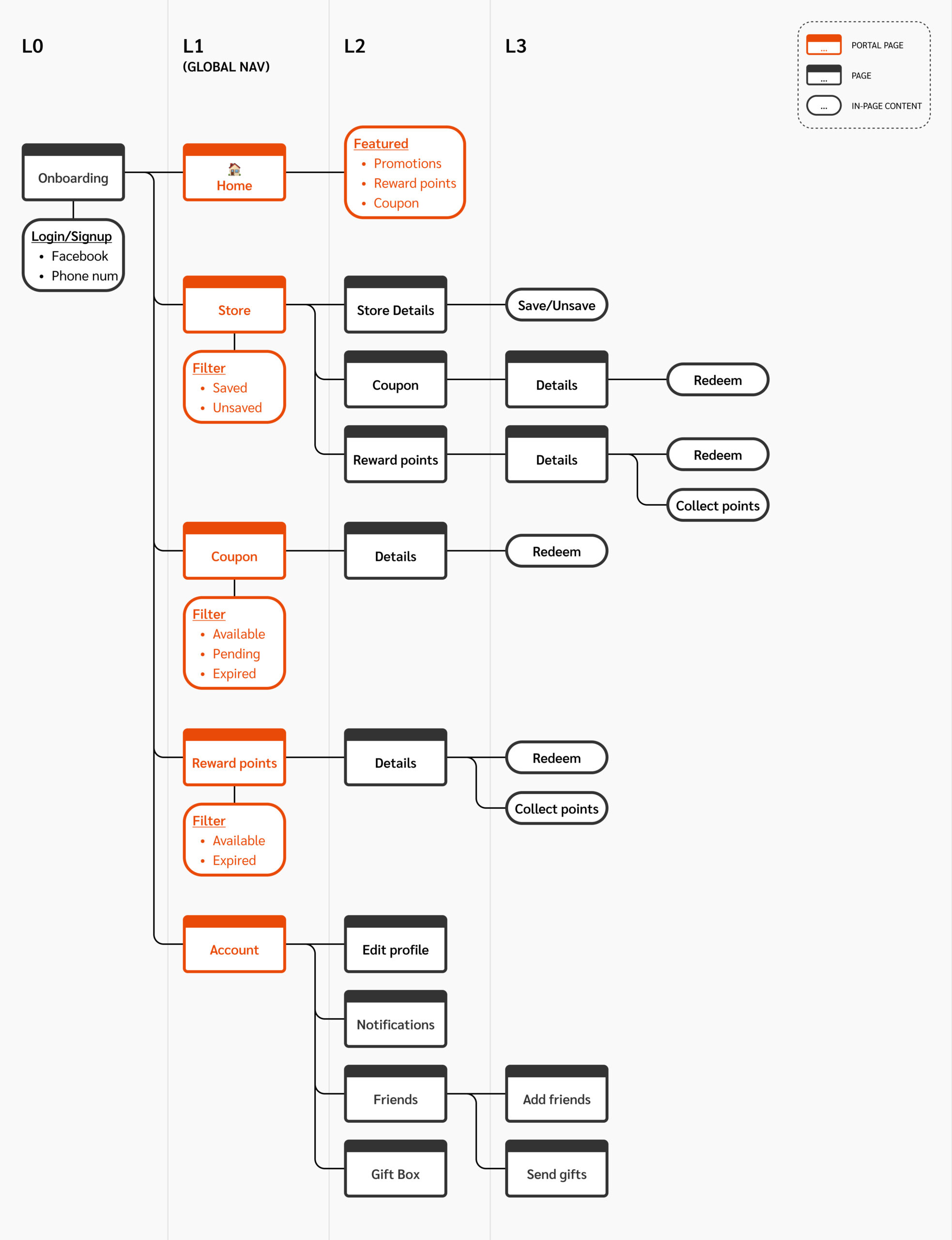
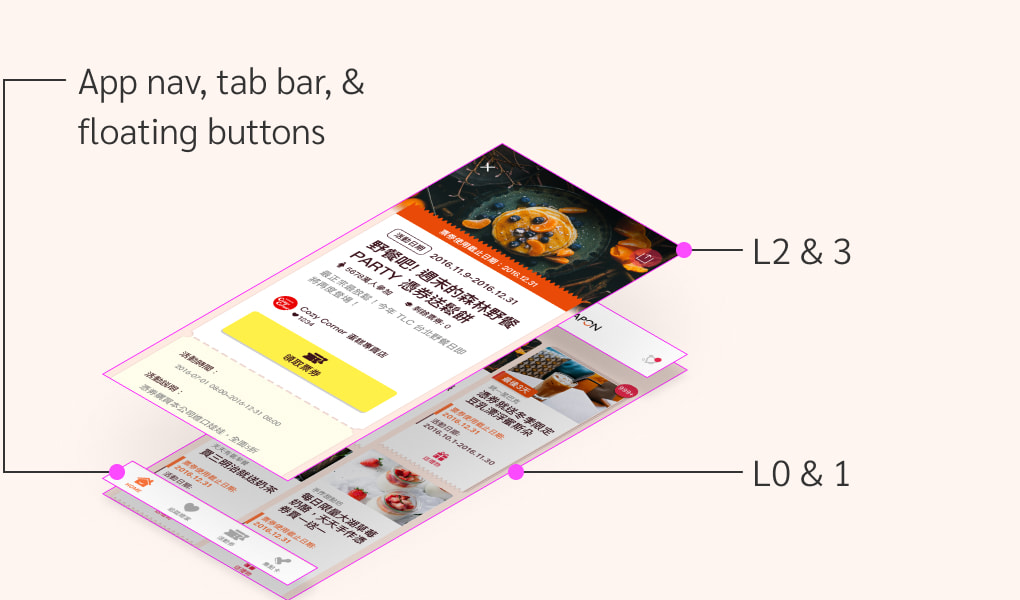
New information architecture —
More doorways on Level 1, less information on Level 2 &3
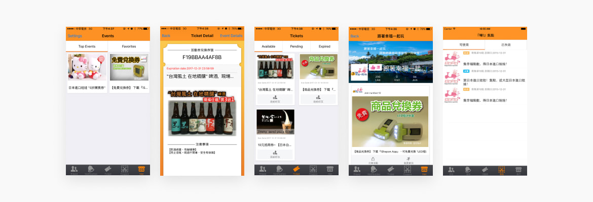
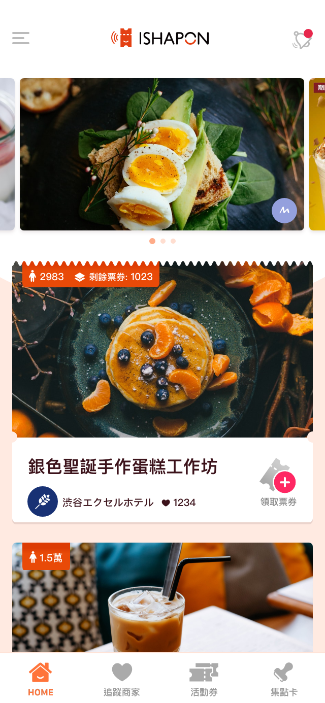
App interface
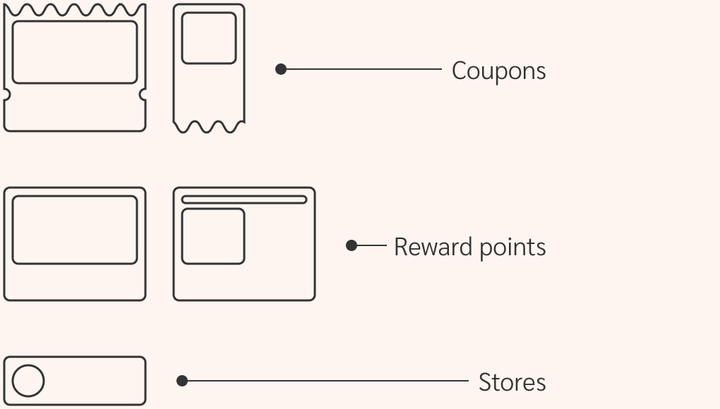
Recognizable card design
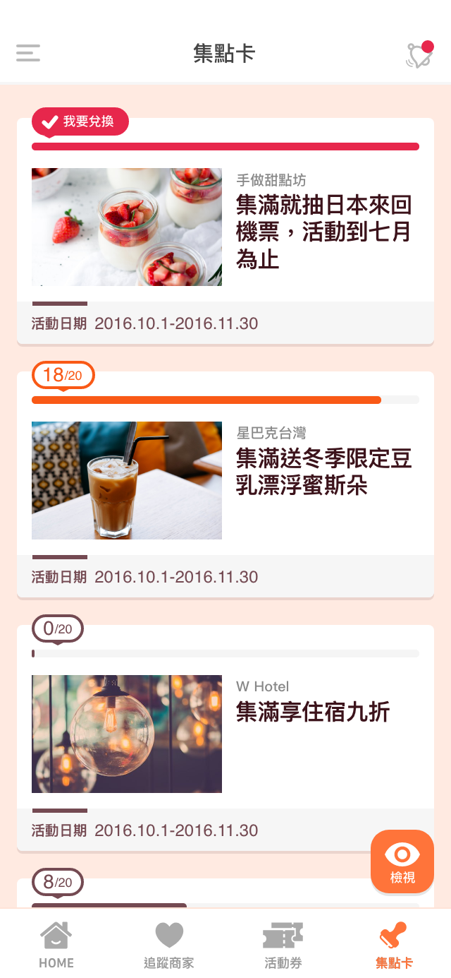
I've created various shapes of cards to differentiate item types. So that when users toggle between pages, they can easily recognize items.
Page transitions
Highlighted page hierarchy with z-axis transitions
I had level 2 & 3 contents on top of level 1 as an overlay so that users can always go back to leave one by clicking the close button.
other transitions
Applied transitions to smooth the app experience
Following the material design methodology, I applied motion transitions to help users orient themselves in the app and aware of system status.
Animation whenever the app starts
Loading transitions when the system is loading items
Parent-child transitions for the filter feature